At Frank, we believe a well-maintained website is just as important as a well-built one. After we hand over your site, we want you to feel confident keeping it looking sharp and running smoothly - without needing to be a web expert.
Here are some simple, practical tips to help you keep things tidy, accessible, and user-friendly.
Avoid using images of text
Images that contain text - especially in homepage banners or carousels - can cause accessibility issues. Screen readers and other assistive technologies can’t interpret text embedded in an image, which means some users may miss out on important information.
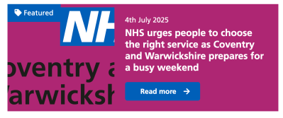
Instead, use a background image in your banner and add the text separately using the content block provided. This keeps your content accessible, responsive, and easy to update.
Need help updating your homepage banner or improving its layout? Just contact Frank Support. We’ll be happy to walk through options and help you make changes that look great and meet accessibility standards.
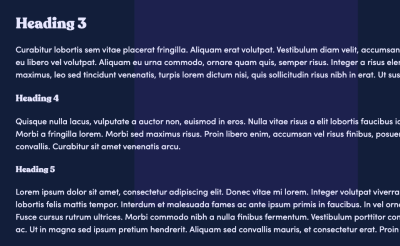
Use heading styles correctly
When adding new content, always use heading styles to reflect the structure and hierarchy of the page, not just to change the appearance of text.
Proper heading levels (H1, H2, H3, etc.) help users navigate content more easily, especially those using screen readers or other assistive technologies.
- Use a single H1 for the main page title (this is usually added automatically)
- Use H2 for main section headings
- Use H3 and lower levels for sub-sections, in order
- Avoid skipping heading levels (e.g. jumping from H2 to H4)
Consistent and logical use of headings improves both accessibility and the overall readability of your content.
You can find out more about correct use of headings on our accessible content guide page.
Icons and images
When introducing new icons to your homepage or other pages, make sure they match the style of your existing set. This helps maintain a clean, cohesive visual design across your site.
We recommend using SVG files - they’re scalable, stay sharp on all screen sizes, and support transparent backgrounds for a polished look.
Need new icons? Just reach out to Frank Support - we’re happy to help source options that suit your site’s style.
The same goes for imagery. If you’re looking to refresh banners or other visuals, Support may be able to assist in finding high-quality images that align with your design, or even create something just for you.
Embedding a video?
Try using a two-column layout, placing the video on one side and supporting text on the other. This creates a more balanced, visually appealing design - and helps avoid the impact of a large, full-width video that can dominate the page.
Adding a short description or bit of context next to the video also improves accessibility and gives users a clear idea of what to expect before they hit play.
Be careful with links and files
Broken links or incorrectly linked files can frustrate visitors and hurt your site’s credibility. Always double-check that links point to the correct pages or resources.
It’s also best to avoid linking to unreliable or non-secure external sites, as this can impact user trust and even affect your search rankings.
We can add a broken link checker to your CMS to give you assurance. Contact Frank Support today to find out more.
Floating images left and right
To maintain a clean and professional layout, always float images to the left or right of the accompanying text.
This allows the text to wrap naturally around the image, creating a more cohesive and visually appealing presentation. Avoid placing images without alignment, as this can make the page look disorganised or cluttered.
Featured content blocks
Get in touch with Frank Support to add featured content blocks to your site.
These sections can include images, text, and buttons, and can be styled with background colours to help them catch the eye and keep your layout looking polished.

Avoid overloading pages with too much content
It’s easy to want to pack a page with text, images, and widgets, but too much content can overwhelm visitors and slow down your site. Long, cluttered pages also make it harder for users to find what they’re looking for.
To create a cleaner, more user-friendly experience, try breaking up content using features like accordions or featured content blocks. Accordions let users expand sections only when they need them, keeping things tidy. Featured content blocks can highlight key information in visually distinct areas, making your page more engaging without feeling crowded.
Not sure how best to organise your content? Contact Frank Support- we’re happy to help with layout ideas and implementation to ensure your pages look great and perform smoothly.
Check how your site looks on every screen
It’s important to make sure your website looks great and works smoothly on all devices - whether it’s a desktop, tablet, or smartphone.
To test responsiveness, try resizing your browser window or view your site directly on a mobile device. This quick check can help you catch any layout issues before your visitors do.
If you spot any problems or need advice on making your content more mobile-friendly, just contact Support. We’re here to help you create a seamless experience for every user, on every screen.
Stick to built-in text styles
To keep your site looking consistent and accessible, use only the pre-configured heading and body text styles available in the CMS editor.
These styles are designed to maintain proper hierarchy, readability, and responsiveness across all devices.
Avoid manually changing fonts, sizes, or colours to style text differently, either in the editor or using HTML. If you want to draw attention to something, try using built-in options like featured content blocks, bold formatting, or highlighted sections - they’re designed to stand out without disrupting your site’s design.
Not sure how to emphasise text effectively while keeping things consistent? Just reach out to Frank Support - we’re happy to help.
Choosing images for thumbnails? Make sure they work well
When selecting thumbnail images for your content boxes, it’s important to ensure they’re visually appropriate and display cleanly within the design. For example, logos with transparent backgrounds often don’t work well as thumbnails - they can appear awkward or unclear (see example below).
Thumbnails should be sized to fit the box dimensions, maintain a consistent visual style, and remain easily recognisable at smaller sizes.
Keeping your homepage layout looking its best
To maintain the visual integrity and styling of the homepage, please do not make layout changes directly via the CMS. The homepage is carefully designed, and adding new blocks through the CMS can disrupt its structure and appearance.
Contact Frank Support for assistance. We can often implement design updates quickly and accurately.
Common requests we can help with:
- Adding extra columns or rows to a box link grid
- Enabling carousel functionality for a row of box links
- Rearranging or updating the layout of homepage elements
- Introducing new sections, such as news or events feeds
Using alert banners correctly
Avoid multiple banners on a single page to prevent user confusion.
If more than one alert is needed, contact Frank Support to implement an alert carousel for better message management.
Adding new sections to the L1 navigation
Adding new sections can cause text wrapping, or the menu to go onto two lines, which affects layout and usability.
If you make before making changes to the L1 navigation, ensure the design remains clean and functional and check the site on multiple screen sizes.